Web App Design & UI/UX
Larky Nudge® • Web App Design PROJECT

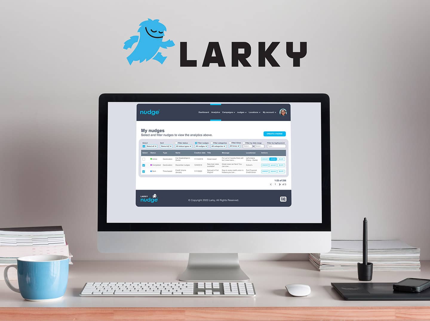
Larky is a mobile and web platform that helps organizations like banks, credit unions, health insurance providers, and universities, connect with their audiences at the right time and place.
Project Duration
February 2020 – August 2020 (7 Months)
Objective
To design the UI for the Nudge® web app using UX principles and research.
Categories
Web App Design
UI/UX
Industry
Tech Services
Year Founded
States With Clients
Total Funding
The DESIGN Process
Leading the design process, we regularly collaborated with the head of Larky’s marketing department, their two in-house developers, and occasionally met with their CEO. The following elaborates on the specific work we did on their web app.
1. UX Expert Review
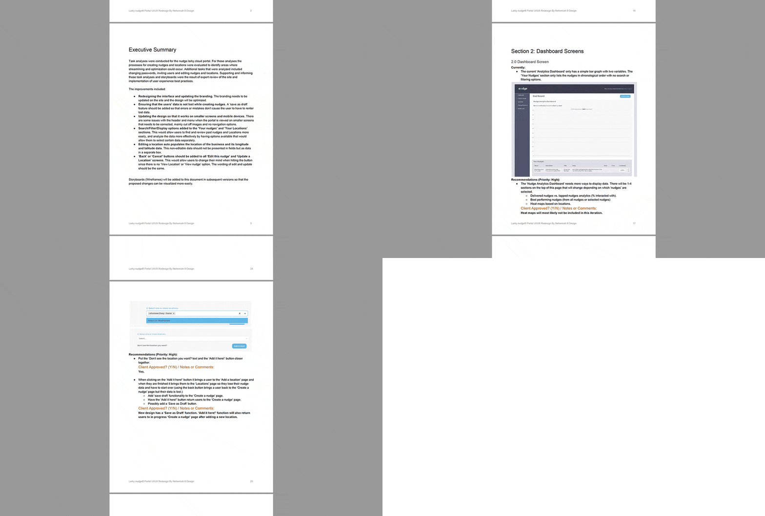
We created a 42-page document outlining the issues that we discovered with the current version of the app.
2. Wireframes
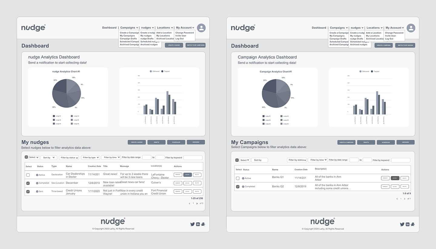
Wireframes were integral in the process of determining logical userflows before updating the design.
3. Mockups
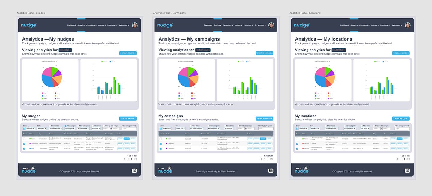
The next stage was focused on improving the user interface of the app and making every element consistent.
4. Prototype
The prototype allowed all stakeholders to test the site navigation and review content before any pages were coded.
5. Accessibility
Every design choice was made with accessibility in mind to avoid excluding anyone from using the app.
6. In-House Development
Larky’s in-house developers then updated the app with the new changes using React.
UX Expert Review
We created a 42-page expert review document, outlining the issues with the current app, as well as listing our recommendations for improving it. Working with Larky’s Chief Marketing Officer, we then redesigned the app section-by-section until it had a logical structure and was polished enough for it’s beta launch.
Wireframes
Through creating wireframes, important decisions were able to be made about the site map, site navigation, userflows, and page content. The content of the site was then broken into list pages, where the data would be stored and organized, and content pages, where the data would be created and edited.
Mockups
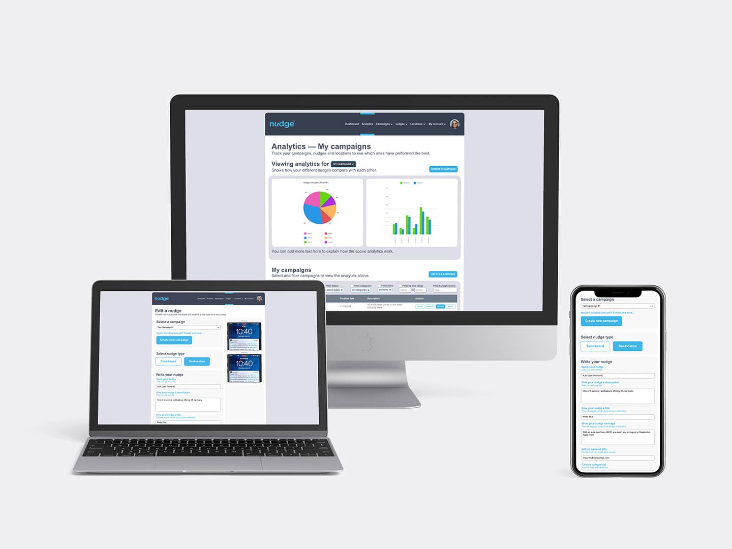
The idea of creating a ‘dark mode’ for the app’s UI was considered before deciding to stay with a more traditional light gray color scheme. The most challenging aspect of creating the mockups was fitting all of the search and filtering functionality into columns that kept the text coherent and legible on all screens.



Prototype
Using the sharing functionality of Adobe XD, everyone working on the site and all shareholders were able to monitor progress, test the site navigation, and review design changes before any pages were coded and finished, which allowed us to make small incremental changes without needing to do time-consuming coding updates.

Accessibility
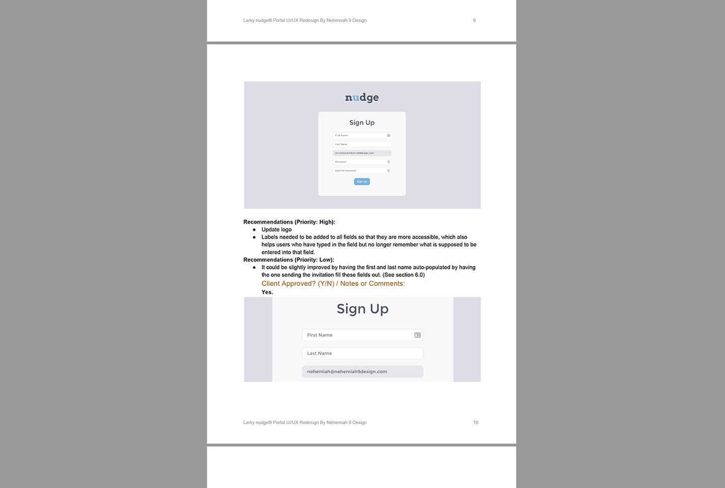
There were a few instances where text color values in the current app needed to be adjusted to pass WCAG standards with sufficient contrast. We also added labels to all text fields to allow for dictation by screen readers for vision impaired users, and to help all users not lose track of which field they were typing in when entering data.
In-House Development
After handing off our final documents: high-fidelity mockups with developer specs (both web-based and PDF files), and an accompanying document explaining all of our design changes and their reasoning, Larky’s in-house development team set to work implementing these new changes in React.


What’s Next
The next stage in the development of Larky Nudge®, after implementing our design recommendations, would be user testing, which would give insight into where users might get tripped up when using the app, perhaps with the wording in the app, or the navigation of the site. The results of these tests would show Larky stakeholders what the most worthwhile improvements might be.
Our Other Design Projects
Click on one of our recent projects below to see a case study for an in-depth look at our design process.
Let’s Work Together!
Let’s connect over email to set up a time to discuss your new project to see how we can work together to become partners to help you grow your business.


